Market Failure Graph Explained with Crypto Examples
Market Failure Graphs: When Crypto Markets Buck the Textbook
When you take your eye off the daily candle charts and memes, crypto markets are an economics lab in real time. Prices whipsaw on rumor, protocols fail in real time, and the classic “supply meets demand” picture far too often seems to have been scribbled over in red pen. To make sense of that chaos, economists rely on a simple yet revealing visual: the market failure graph. Today we’ll pull that diagram out of the lecture hall, plug in on chain data, and see how it explains everything from impermanent loss to DAO treasury shortfalls.
1. Negative Externalities on the Blockchain
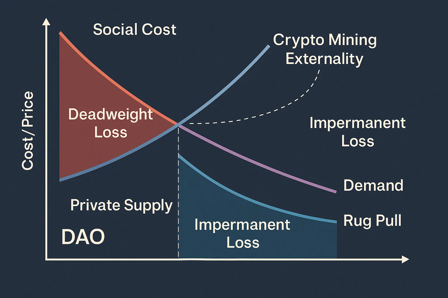
Imagine the textbook externality graph: supply curves shift to the right when producers ignore social costs, forming a wedge of deadweight loss. Now replace “coal plant” with ASIC powered Bitcoin mining. The external cost is not smog but a spike in energy demand that prices local grids out.
- On chain example: 2021 Texas freeze, when miners briefly outbid homes for power.
- Graph adjustment: Include a secondary Y axis that tracks megawatt hours. The social supply curve shoots up steeply after grid fees kick in, increasing the welfare loss.
Expert takeaway: Those regulators weighing carbon taxes can place the optimal Pigouvian fee directly onto that graph. Protocol designers also can with a dynamic difficulty adjustment charging energy intensive blocks.
2. Deadweight Loss and Impermanent Loss: Twin Trouble
On a standard market failure graph, deadweight triangle represents the exchanges which should have taken place but did not. When prices move, something curiously similar occurs in AMMs like Uniswap: liquidity providers trade value that they did not mean to lose.
| Classic Econ Term | DeFi Parallel |
|---|---|
| Market price ≠ Social optimum | Pool price ≠ External reference (oracle) |
| Deadweight loss | Impermanent loss |
When ETH dropped from $2 k to $4 k during 2021, LPs of the ETH/USDC pool lost approximately 20 % of possible gain — but the graph predicted so. Scale the X axis to mark the percentage of liquidity, and the area of the triangle is the amount withdrawn from LPs to arbitrageurs.
3. Public‑Goods Failure in DAO Treasuries
DAOs love the slogan “public goods are good,” but treasury voting barely backs the slogan. The under provision graph raises the social demand curve above the private one. Token holders in a DAO discount future protocol health against current token price.
Gitcoin research illustrates matching pools finishing 30–40 % short of socially optimal funding when whales opt out. Plot that shortage — the gap shouts why quadratic funding is necessary.
4. Asymmetric Information and Rug‑Pull Risk
General models dismiss adverse selection when one party is more informed. Deployers in crypto can be draining key holders. The market failure curve shifts: demand shifts left as smart traders discount rugs.
- Case study: The 2021 Squid Game token. As warnings on this from Tweets materialized, marginal buyers vanished, volume imploded, and the price blasted upwards before its infamous plummet.
- Graph insight: The welfare triangle is not a loss of trade, but actually illustrates the capital that leaves to sheltered assets — typically USDC or stETH — hurting protocol growth.
Multisig configurations that are transparent move the demand curve in the direction of equilibrium by reducing the information asymmetry.
5. What the Graph Misses — and How to Fix It
Legacy charts freeze time. Crypto markets do not stand still for photographs — they move like TikTok. Slippage, MEV, and flash loan exploits redefine curves block by block. That requires an animated market failure graph:
- X axis: volume traded per block
- Y axis: effective price including MEV
- Overlay: dynamic welfare areas updating every 12 seconds
Plumbing live data into D3 with tools such as Dune and Flipside is already possible. The result is not just prettier — it catches failures early enough for protocol governors to intervene.
Conclusion
A humble two curve graph still packs a punch in the wild west of crypto. Load it with mining’s hidden costs, impermanent loss math, DAO funding gaps, and rug pull probabilities, and the picture turns into a dashboard for builders, traders, and regulators alike. Master it, and you’ll spot the cracks in a protocol long before they become the next headline exploit.
FAQ
What does the simple definition of a market failure graph entail?
It’s a chart illustrating how actual world markets miss the “sweet spot” where resources become utilized with maximum efficiency, creating a wedge of welfare loss for society.
How is it applicable to crypto markets?
These externalities like mining energy usage, knowledge gaps driving rug pulls, and under-capitalized public goods in DAOs all shift the curves on the graph, revealing economic losses unique to blockchain environments.
Can interactive graphs improve trading decisions?
Yes. Real-time visualizations that update with on chain data help traders and builders detect liquidity gaps or rising external costs before they spiral into expensive failures.
Where do I host my own animated market failure chart?
Tools like Dune Analytics and Flipside Crypto allow you to query blockchain data and pass it into JavaScript libraries such as D3 to create live, browser based charts.
➔ Post created by Robert AI Team